Friday, August 19, 2011

Crazy Reference

To be an illustrator I think it helps if you are a bit of a ham. I can confidently say I fit that description.
Often I have an idea in my head for an illustration that I can and will sketch out but it helps to have some points of reference. I had an few ideas for an illustration I was asked to do for the RPG (role playing game) called Burning Wheel. The illustration in question asked for a cool action shot. So, I had to get my actor/ action hero face on- meaning I ham it up while Laura takes some pictures.
I don't remember the exact description, but I think it was about special light chain mail which allowed for speedy movement. I actually got an idea for the pose from a Bouguereau painting.
Here is the image I came up with.
Copyright © 2011, Burning Wheel and Richard Luschek
I did a sketch for the basic idea and used that to make sure I was able to get all the needed photos. I got dressed up in a chain mail shaped smock I have and had my lovely photographer take a bunch of pictures. I had to lean up against a wall for part of it to get this to work. The following is made up of at least two separate photos. Then used photoshop to cut the parts apart and tilt and manipulate them into a close approximation. You can see the break at the waist. Here is that paper doll like assemblage.

I think the black socks are  nice touch. It is also funny to note that I am holding an arrow for some reason. This was before I got a cool sword to use for reference. I think you can see I did not copy it exactly, but it did help me tremendously to figure out a spacing gesture. It is also a wonderful way to understand the light and shadow on complicated forms. For a painting I would want more reference from nature, but as these are small pen and ink drawings the info in the photo is enough.
Here is another one for Burning wheel.
Last year I also drew a female magician with her imp helper. My wife posed for the lady and I posed for the imp.


Copyright © 2011, Burning Wheel and Richard Luschek
I was asked to revisit this Magician and her cute little imp for their recent Burning Wheel Gold book. I doing the first image and was looking forward to doing them again. This time she is casting a spell as the imp cowers behind.
Here was the description I got from Luke Crane the creator of the game.
"Full Figure. 5" high final size.
Using the same template for the sorceress you did for us in the last book  (because that is one of my favorite BW illustrations ever) Let's have her holding staff and sword -- all Gandalf-like -- while casting a spell. Bonus points for including her homunculus again!"
Copyright © 2011, Burning Wheel and Richard Luschek

Of course I made such a good imp, I got my actor face on and posed again.

Copyright © 1969, My Mother and Father
Sorry if this is too sexy for some of you. Yes, I got in the shower and went shirtless for this one. It was particularly challenging to turn the handsome devil you see in the photo above into a creepy imp. I was partially successful, the imp is still pretty cute.


Sunday, July 31, 2011

For the Birds

Occasionally when I am asked to illustrate an article I do my best to render or elaborate on a scene already in the text. Occasionally if I think it needs a bit more I will create my own little story to help give the art some life. One such article was the Birds of Harn article I did last year. I thought it might be interesting to post a few of the ideas I had for these illustrations that never were described or mentioned in the text. As it is a fantasy world anything is possible, but I try to make it as believable as I can. Most of the ideas are taken from, or similar to, things I have read in real world medieval folk lore.
I did 23 drawings of different birds for this article available on the Columbia Games site. I will discuss just a few of them below.

Copyright © 2011, Columbia Games, Inc. and Richard Luschek 
Above is a goshawk. A fairly typical looking bird, but I added some distinctive markings. I drew the bird with tear shaped markings. This may be an animal sacred to Peoni- the goddess of healing and agriculture, since it is said to cry after every kill. Kuboran barbarians mention the bird in their culture, with these markings resembling their facial scars.These bits of made up folk lore add depth and interest to the world of Harn- at least that is my goal.
Copyright © 2011, Columbia Games, Inc. and Richard Luschek
I drew the falcon perched on the head of a statue that could be on the top of church in any Harnic city. I was thinking it could be Valamin (on a Laranian church), or Belsirasin the weeper (on a Peoni church).

Copyright © 2011, Columbia Games, Inc. and Richard Luschek 
 This owl has a beard. I was thinking it could be called the flying Khuzan (Harnic Dwarves), or something similar.  Some believe that they are sent by the dwarves to watch men. Also a good story to be used by parents to scare children that they have to behave because the Khuzan Owl is watching.
Copyright © 2011, Columbia Games, Inc. and Richard Luschek
Most Harnic fans probably figured out my goal here. This one is a Peoni priestess saying a prayer holding a daisy and a chicken upside down. A prayer is said each time a chicken must give up its life for dinner. 

Monday, June 20, 2011

ILME

I am about to start work on a rewritten and reworked article on a Harnic meredragons. I have never been thrilled with any of the past pictorial representations of these creatures.
The article has been much improved and expanded upon, so I am trying to do the same for the illustrations.
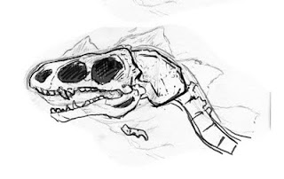
These creatures are most easily described as intelligent talking dinosaurs, so I thought I should at least learn how to draw the real world exstint creatures. Using a some books I started studying and sketching dinosaurs.
Here are some of the more successful ones:
Then I tried my hand at the creature called Ilme trying to follow the old illos and descriptions, but making improvements. I am still not done, but getting close. Let me know if you have any comments- especially you Harn Fans.


Copyright © 2011, Columbia Games, Inc., N. Robin Crossby (1954-2008) and Richard Luschek

Sunday, June 12, 2011

Artist at Work

I have been working very long hours lately trying to compose three imaginative paintings for a commission. I will discuss the details of this later and post some process shots. I do a lot of illustrations, but these will be fully rendered oil painting 3 foot by 2 foot. It is a very different and complicated process for me. I need to work out everything for the over all design now. I think at least two of them are coming along nicely. The color studies are due tomorrow, so I will have another late night.

 Just a typical day drawing on the computer.
Unfortunately my illustration studio is in the basement. I am near some nice windows and we have it set up so it is quite comfortable (I say "we", but I mean Laura my wife.) Still, it is gorgeous outside and the light in my studio must be amazing today. Once these go to canvas I will be able to leave the dungeon, but now I am at the computer.
Here are some action shots of me at work.
I am using a Wacom Tablet, that allows me to draw on the computer. I do pencil sketches, scan them into Photoshop and then rendering them in full value. As you can see in the photo, I picked a basic color scheme for the picture and have thrown a red filter over it. I will be adding more color today, but it will mostly be a red picture.

It has been a fun process, but my hand is really getting fatigued. I have been wearing one of those carpel tunnel wrist braces at night. Seems to be helping.

For some strange reason my neck is getting sore.

Saturday, June 4, 2011

Making Props

I am working on a job where I have to do three paintings of knights. Each painting will be 3' x 2'. They have asked for paintings in the style of 19th century romantic paintings. That is a tall order. I will talk about this and show process shots on this later.
So to get everything right; the poses, lighting and color, I will have to hire models and set up the scenes to paint from. I ordered costumes from a site online but I needed some shields.
I decided to make some of my own. I needed a few different styles from the later period of the knights Templar. With a limited budget I figured by making my own and would save at least $350. Plus I could customize them to my own liking. It also leaves open the possibility of mass producing a bunch of shields for assembling my own personal army- always a dream of mine.

I found a site online that had some great advice for crafting your own curved shields. Following the instruction on the site, I built my own shield press to make the curved shields I needed.


Above is the shield press. Two quarter inch sheets of plywood, each 2' x 4' can be glued back to back and clamped smoothy around this curve. I drew the designs of the shields on the top sheet. They were put in the press and clamped to the curve using ratchet straps. I will not go into detail here. As I said there is a great site to visit if you are interested. Check out Ye Olde Gaffers site if you want to read on the subject further.

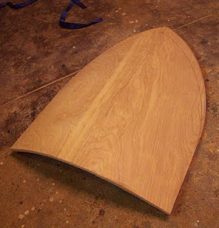
Here is the plywood unclamped after a full day allowing the glue to dry. The two 1/4 sheets are now one 1/2 curved shape. I use a jig saw to cut the shape out.
The shield blank is sanded smooth the edges cleaned up with a belt sander. Next I glued a heavy fabric on the front, around the edges and to the back. This will add strength, smooth it out, and take paint better than the plywood.
I then got some old leather belts at the thrift store for straps on the back. The shields typically had a pad on the back to protect the arm. I used an old heavy blanket to make the pad and covered it with suede cut from one of Laura's old skirts. I tacked that on the back, drilled holes for the handled and bolted them on. They were typically riveted, but this was way easier.
Here are the finished shields painted and waiting for the crest to be added.
This is a the front of both shields. The one on the left is called a heater shield the one on the right a kite shield or cavalry shield.
The back showing the handles and arm pad. I will probably grind the bolts down a bit to make them look more like rivets. I still need to add a should strap which will just bolt on the top two bolts of each shield.

It may seem like over kill, but it was not too hard to do. Plus I love this kind of procrastinating project. 
Now I suppose I should paint the pictures.

Wednesday, June 1, 2011

Updating a drawing.

I was recently asked for a small illustration to advertise someone's Harn game session at a convention- Des-Con 2011. It would go in the convention catalog. They are running the adventure 100 Bushels of Rye.
I did not to any of the illustrations for that adventure, those were all done wonderfully by Eric Hotz.

I did to an illustration of one of the characters in the adventure- Sheriff Maldan Harabor. I thought of sending the image I did for the Olokand article, but decided to just do an updated version of it. I really like this illustration, but it was a bit clunky. It was a done almost 10 years ago and I thought it needed an update. I often cringe at some of my early illustration work and hope I keep improving so I can cringe at the stuff I am doing now- but it is a problem if there is an opportunity to reuse art. I often end up reworking it.
Copyright © 2010, Columbia Games, Inc. and Richard Luschek  
I thought I would just touch up the face of Maldan showing him without the hat on, a more relaxed I am going to take over the throne kind of look.
So here was my first image reworked in photoshop. I was able to sculpt his head out a bit more and give it more form.
Copyright © 2010, Columbia Games, Inc. and Richard Luschek
Here he is without the hat and without hair. I got a few complaints from some of the Harn writers that his dad is not bald so he should not be. I don't think genetics works that way, but I thought about it and threw on a full head of hair. It was also suggested he looked too much like a Klingon.
Copyright © 2010, Columbia Games, Inc. and Richard Luschek
Feel free to save these images to use in your game if you like. Let me know which one you like better- I still prefer the bald one.

Monday, May 30, 2011

We don't need no Stinkin' Badges

How does that saying go?
You can satisfy some of the people all of the time. You and satisfy all of the people part of the time, but you can't satisfy all of the people........ I just lost my train of thought.
Point is, it is hard to satisfy everyone.

Illustration can be a tough business. In fine arts, most of the time the painter gets to make a product that is placed into a gallery and if someone likes it, they buy it.
An illustration is ordered by a client, laid out in a book which is then distributed to a bunch of people that may or may not agree with your representation. I do most of my illustrations for the game world Harn, which has been around for over 20 years. It has a loyal following of intelligent players, well versed in that world and everything historically related to it. So I have to be on my 'game'.  I can't be doing any armor or weapons that do not fit the period. I got an email once for someone telling me I illustrated the arrow on the wrong side of the bow.
I think most of my work is pretty well received. I get the occasional "I always imagined that guy with a full head of hair" kind of comments, but basically I think the customers like what I do. I work pretty hard to satisfy.
Recently I did an illustration that I got some flack for in the online game forum. The problem is that I did what I thought looked cool, and it turned out to not work so well historically. It has been printed and delivered to customers all over the world. Too late now.
So I thought I would post some of the ideas and images here. First to explain why, and second so those not happy can down load these images if they want.
The idea was to draw some symbols for various groups of mercenary units. I did not want typical heraldry symbols. I thought they should be iconic, simple and easy to read. The groups were named, and I tried to come up with symbols that matched. The writer had suggestions and even mocked up a few.
I did pen and ink line images and dropped in color in photoshop.
Copyright © 2010, Columbia Games, Inc. and Richard Luschek
They look a bit harsh and stiff. In hind sight, they probably should have had different styles too.
I took the above image and lowered the saturation of the color a bit to make them look old and darkened them down.
Copyright © 2010, Columbia Games, Inc. and Richard Luschek
Getting a bit better. These maybe would have worked fine. I should have stopped here.

I thought it needed to be a bit funkier and I added a texture to it by scanning some canvas texture into photoshop and adding it on top of the image. Now I thought it looked cool, aged the image and made it a bit more like a badge.
Copyright © 2010, Columbia Games, Inc. and Richard Luschek

Boos and hisses from the crowd.
Well I tried. Lesson learned. I agree with the criticism now, so in the future I will not be doing this. I will have to come up with a new way to get the effect. The above does look too much like a modern screen print. Kind of reminds me of a prize you might get in a cereal box- "Kool Harnic Mercenary Badges for your Mom to iron on your Denim Jacket!".  It would have been more successful to do shield designs or some clumsy paint job to give them an authentic look.